DAV Valparaíso
From orphaned social accounts to documented institutional governance — a digital identity strategy and custom WordPress build for a hiking club with 117 years of history.
Hybrid Profile — UX/UI + Front-End
Visual hierarchy, typography, and message clarity — engineered into interactive, production-ready code.
Philosophy
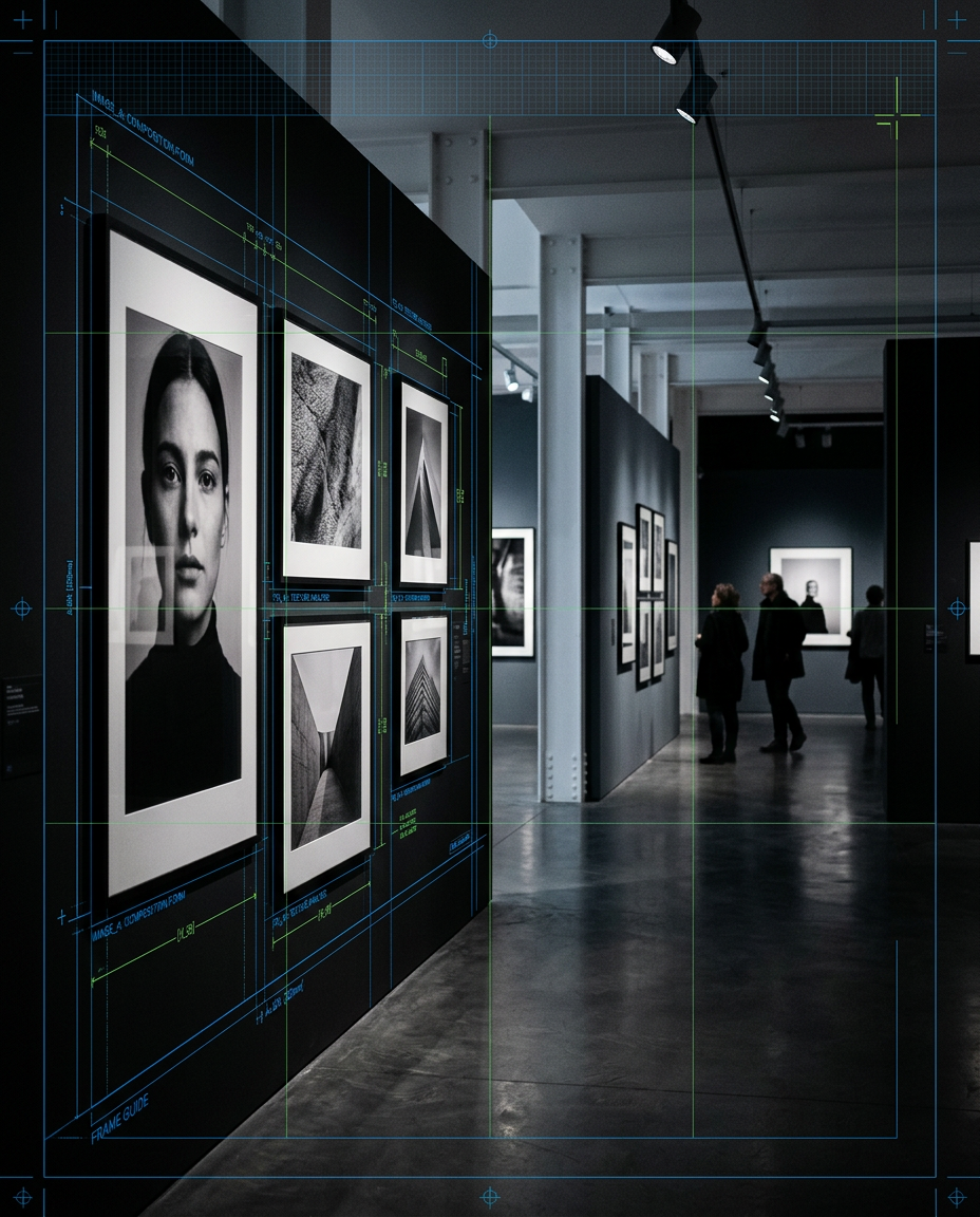
None of this started as a plan. Editorial design led to museography — laying out exhibitions for a public institution with 117 years of history, where the job was never decoration, it was making history legible to someone who'd never encounter it otherwise. That's the thread that never broke: taking something dense — a message, a dataset, a product — and giving it a shape people can actually read. Front-end code turned out to be the same job, just with a browser instead of a gallery wall.
Most interfaces are engineered first and designed after — patched with visual polish once the logic is already locked. That order shows: inconsistent spacing, unclear hierarchy, components that work but don't communicate.
A background in editorial design means grid, type, and hierarchy come first. Every screen gets laid out before it gets built, not decorated afterward.
Front-end development stopped being a separate handoff somewhere along the way. Code became the medium the design ships in, not a translation of it.
AI tools — Claude, specifically — now sit inside that same process: accelerating iteration on design systems and front-end architecture, never replacing the judgment that decides what's worth building.
Selected Work
From orphaned social accounts to documented institutional governance — a digital identity strategy and custom WordPress build for a hiking club with 117 years of history.
Three practices — restoration, patrimonial photography, teaching — needed one coherent home he could run himself. A custom WordPress theme built for exactly that, no paid plugins.
No existing brand, no existing site — just a service list that needed to become something clients would actually trust. Built the identity and the platform from zero.
The agency's whole pitch was 'one page, one journey' — so the navigation itself had to prove that, not just claim it in the copy.
Trust is the entire product when a mechanic shows up at your door, not the other way around. Built the brand — logo, van signage, site — before the first van left the shop.
A wide list of programs and courts, one clear job: get people to actually book. UI design and visual prototyping for an indoor padel club in Miami.
What makes premium pet food premium is invisible on a shelf. The site had to make the nutrition itself the argument.
Bookings were running on WhatsApp and a paper notebook — real availability lived in someone's head. Built a live platform that doesn't double-book.
The hard part was never the grading screen — it was making sure one school's data can never leak into another's. A multi-tenant school-management MVP, shipped in phases.
Experience
Fig. 02 — Museography & Outreach
Stack
Where concepts get tested against real content and real constraints — before a single line of CSS depends on them.
No framework layer between the design and the browser — the mockup becomes markup, directly, so nothing gets lost in translation.
Used to accelerate iteration on design systems and front-end architecture — never to replace the judgment that decides what's worth building.
Contact